


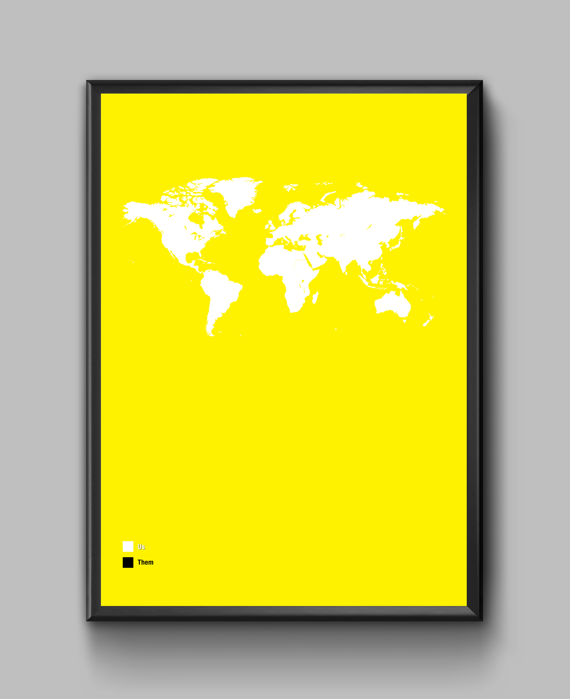
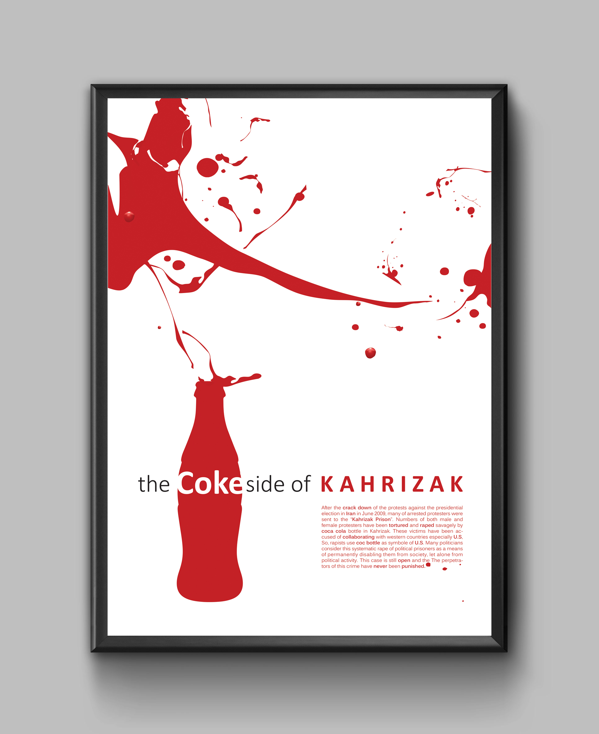
visual infography
visual infography
Jurnalism in jail- Installation
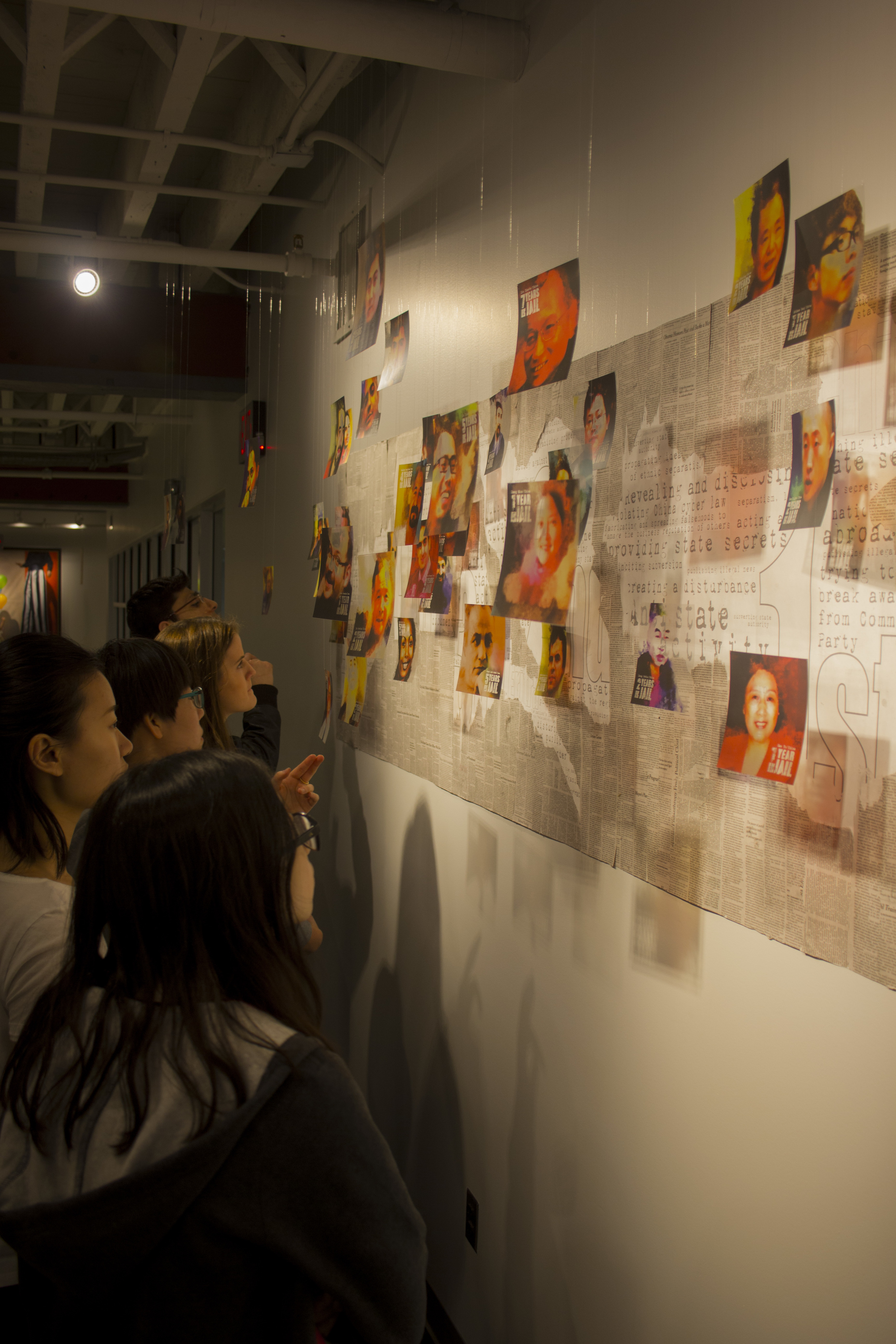
This project aims to spotlight how the imprisonment of journalists and absence of journalism negatively affects the exchange of information. This installation contains a big board covered by shreds of newspaper, and 42 transparent slides hanging from ceiling. The shape of five countries with the highest number of imprisoned journalists can be recognized on the board. Through these shapes, viewers can find the main charges for which journalists are in jail. The slides also show the portraits of imprisoned journalists, their names and the time that they have been in jail. By setting light on the slides, the shadows of faces distort the information on the board. The blending of shadows and information emphasizes the idea of information distortion and necessity of transparency in information delivery. It also highlights how absence of journalists can negatively affect the free flow of information.
This project contains many details and all visual components are cautiously designed in advance. From the typefaces used on the slides to the board and collage technique, all has helped to convey the message in an interactive way. The portrait of journalists is depicted painterly to give them the look of a hero as they really are. The saturated colors on slides also make more impression on the faces of journalists. The way these slides are hanged from the ceiling empowers the feeling of suspension and being absent in the society.


Typography & Layout
Typography & Layout
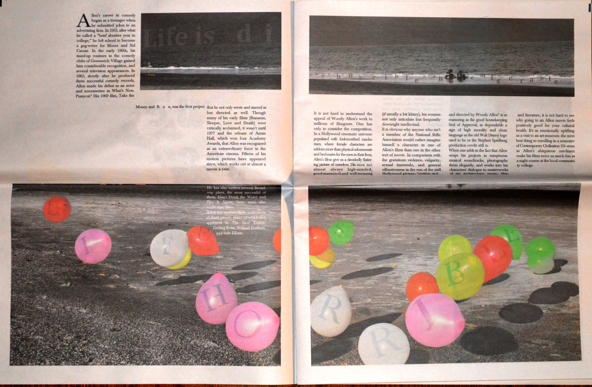
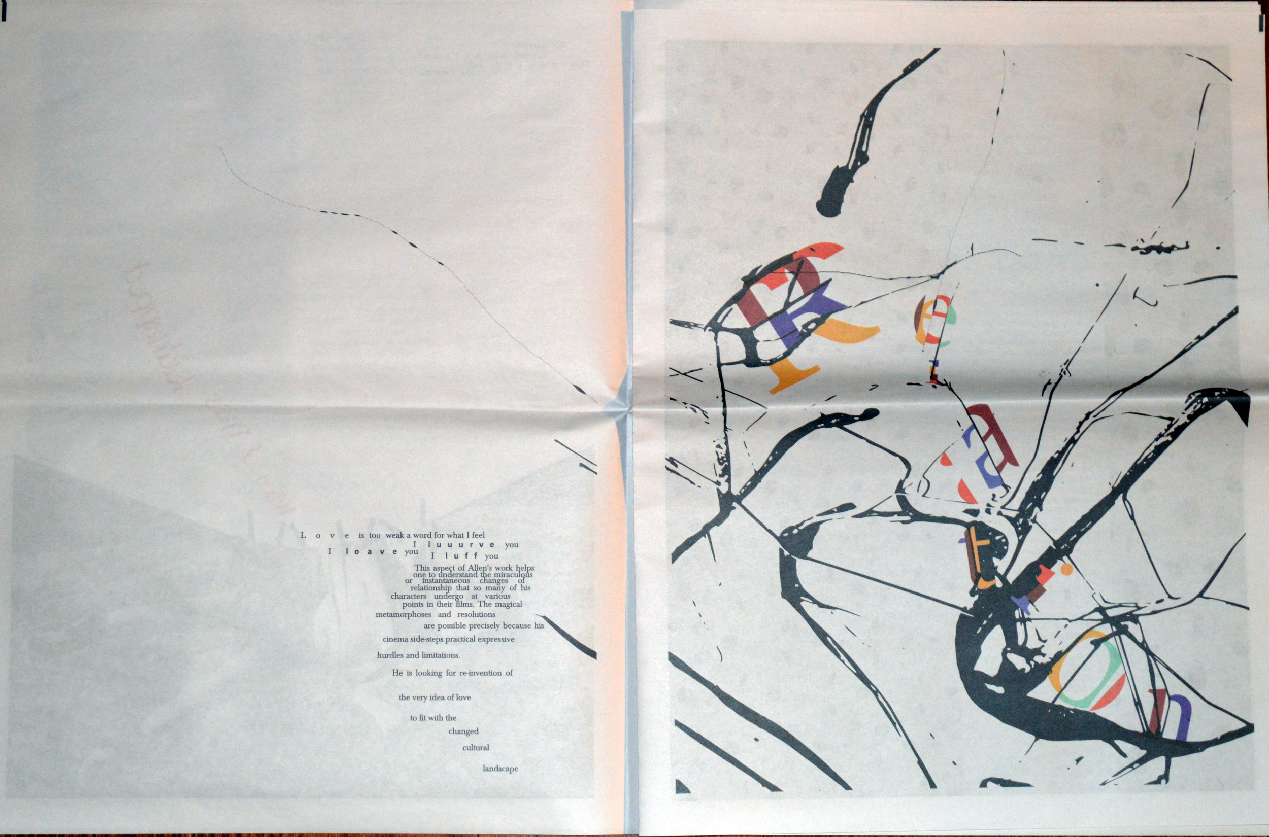
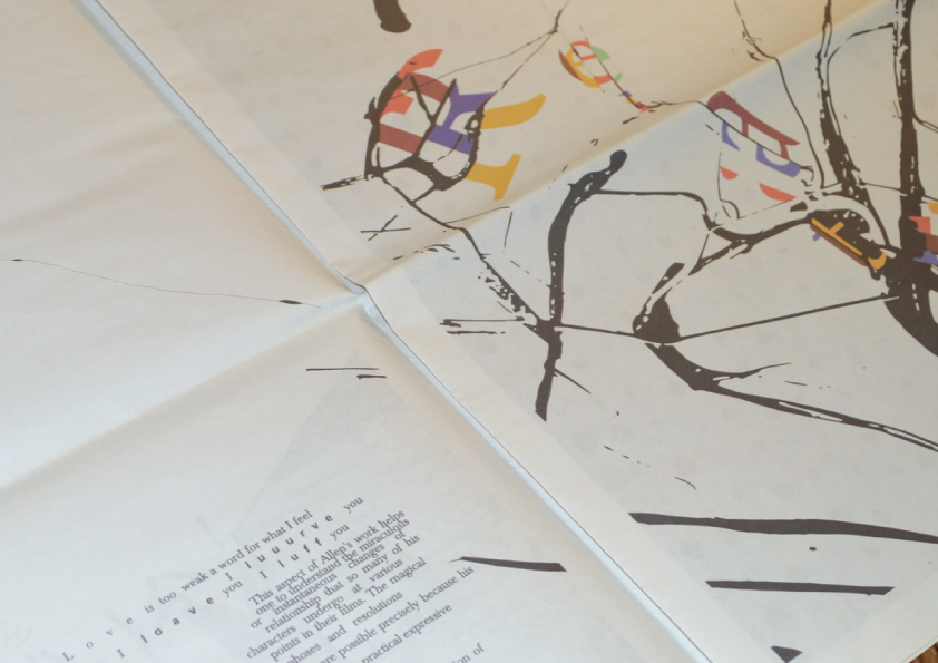
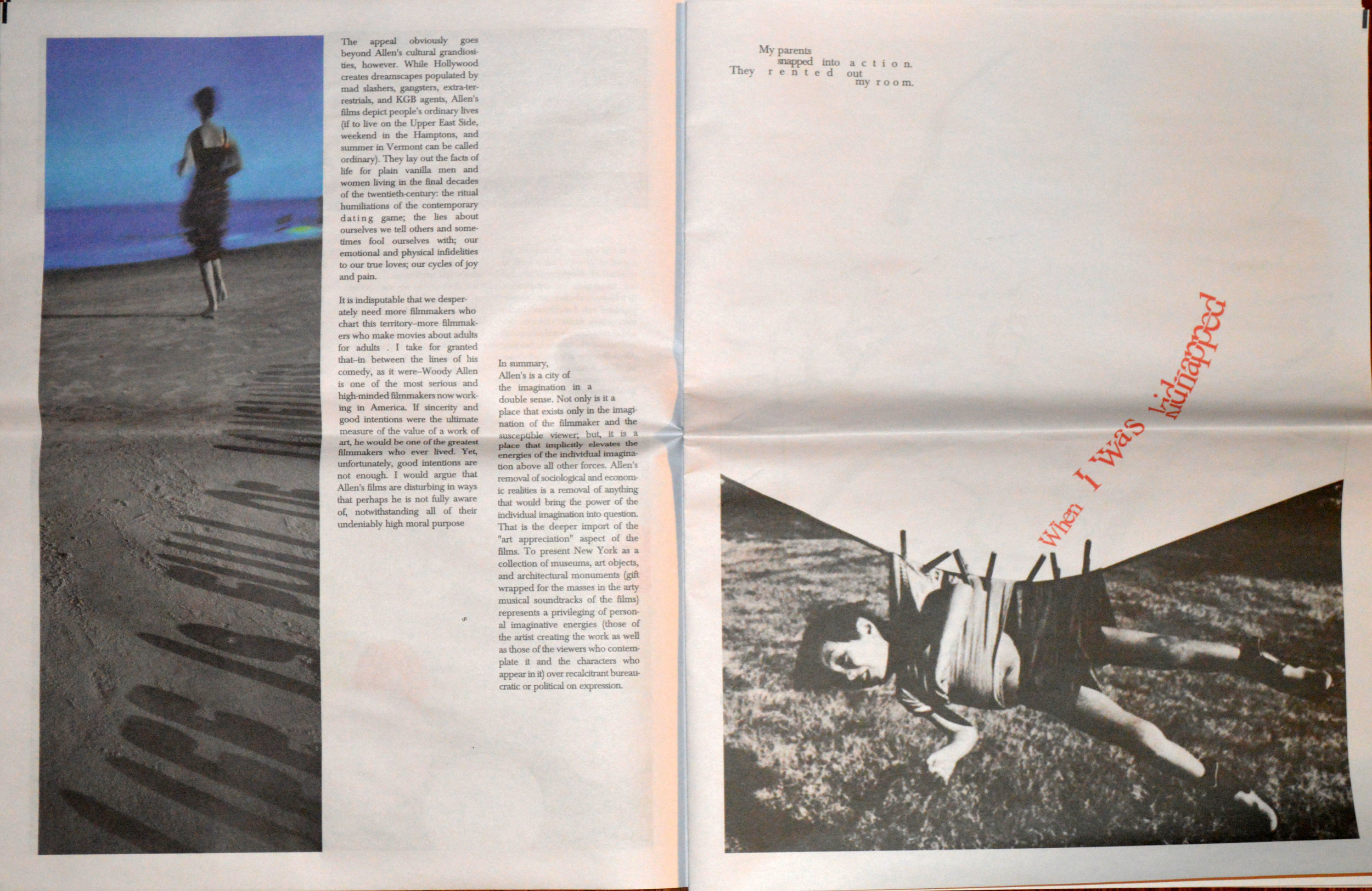
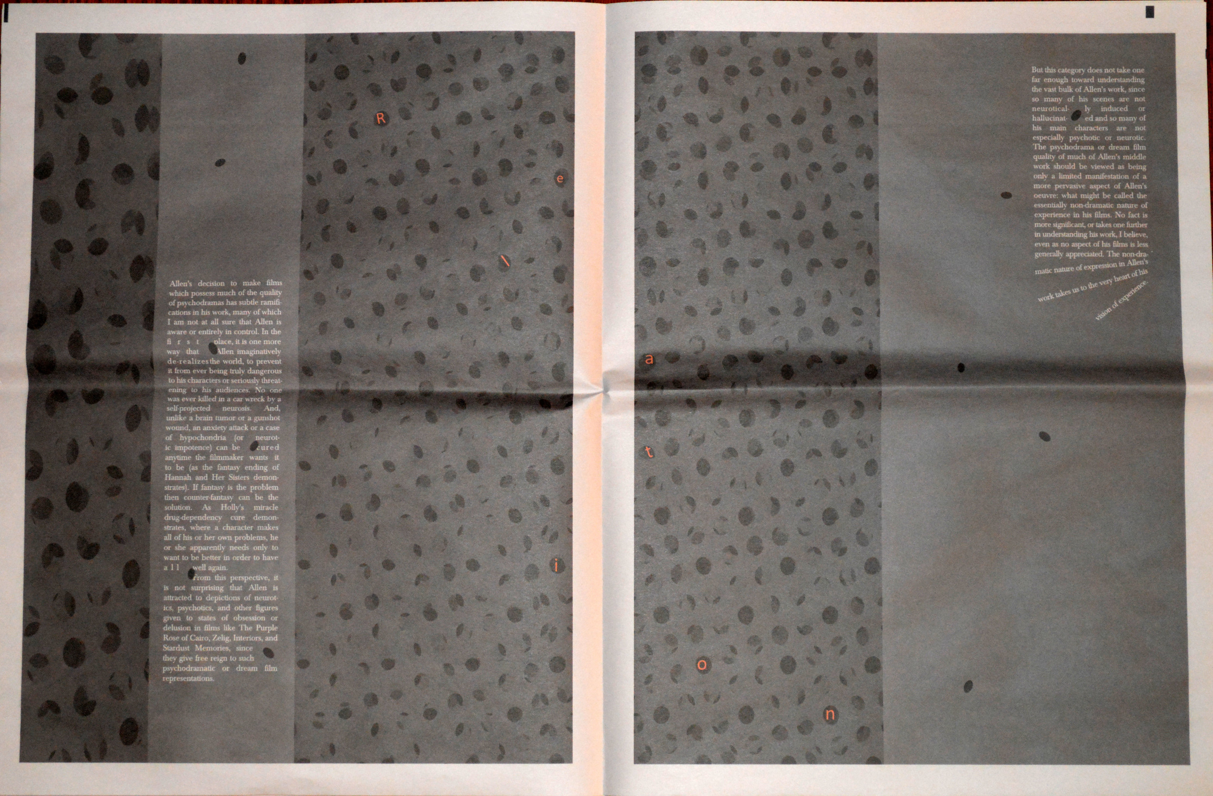
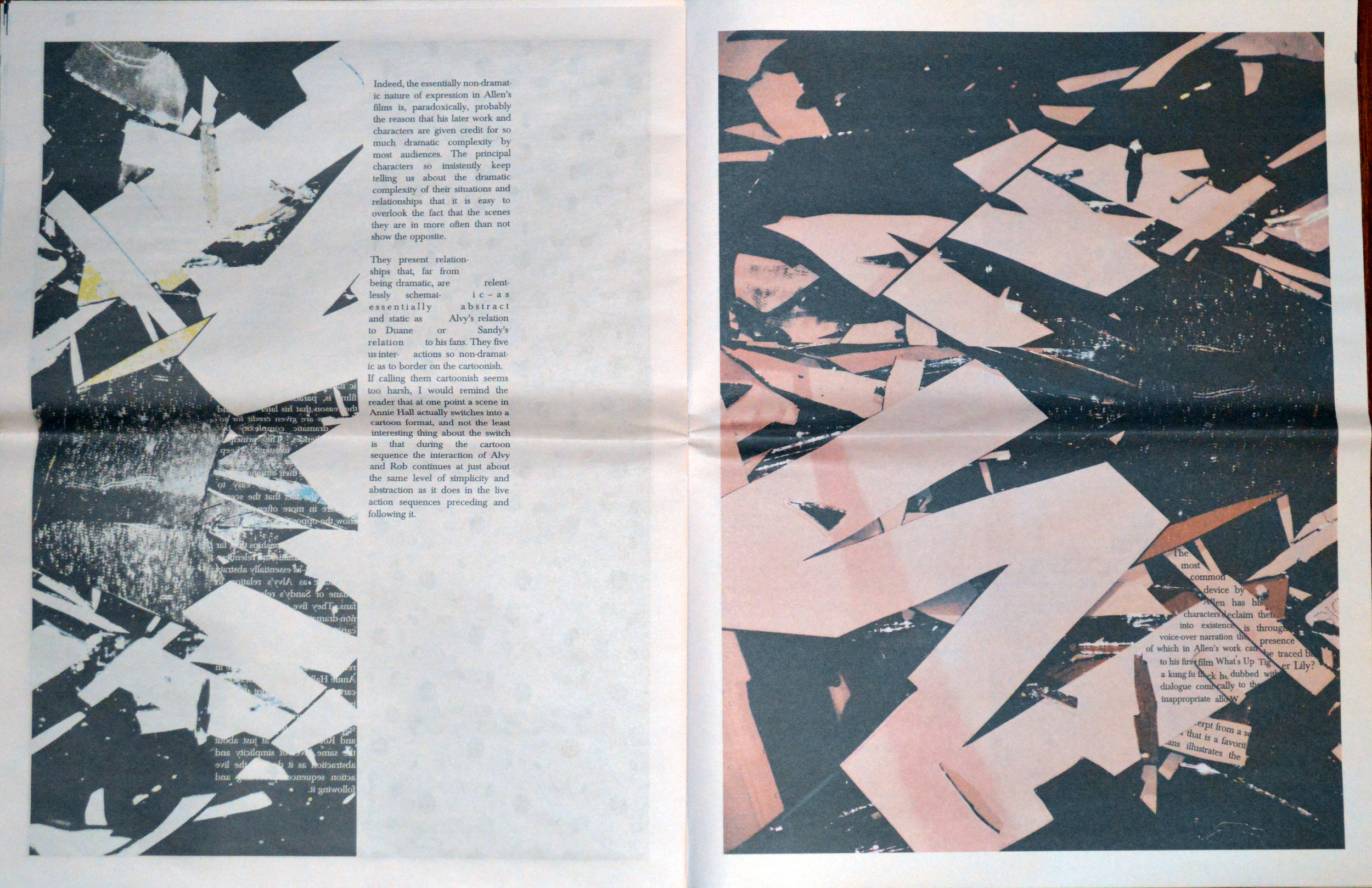
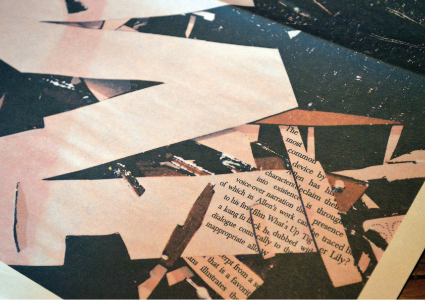
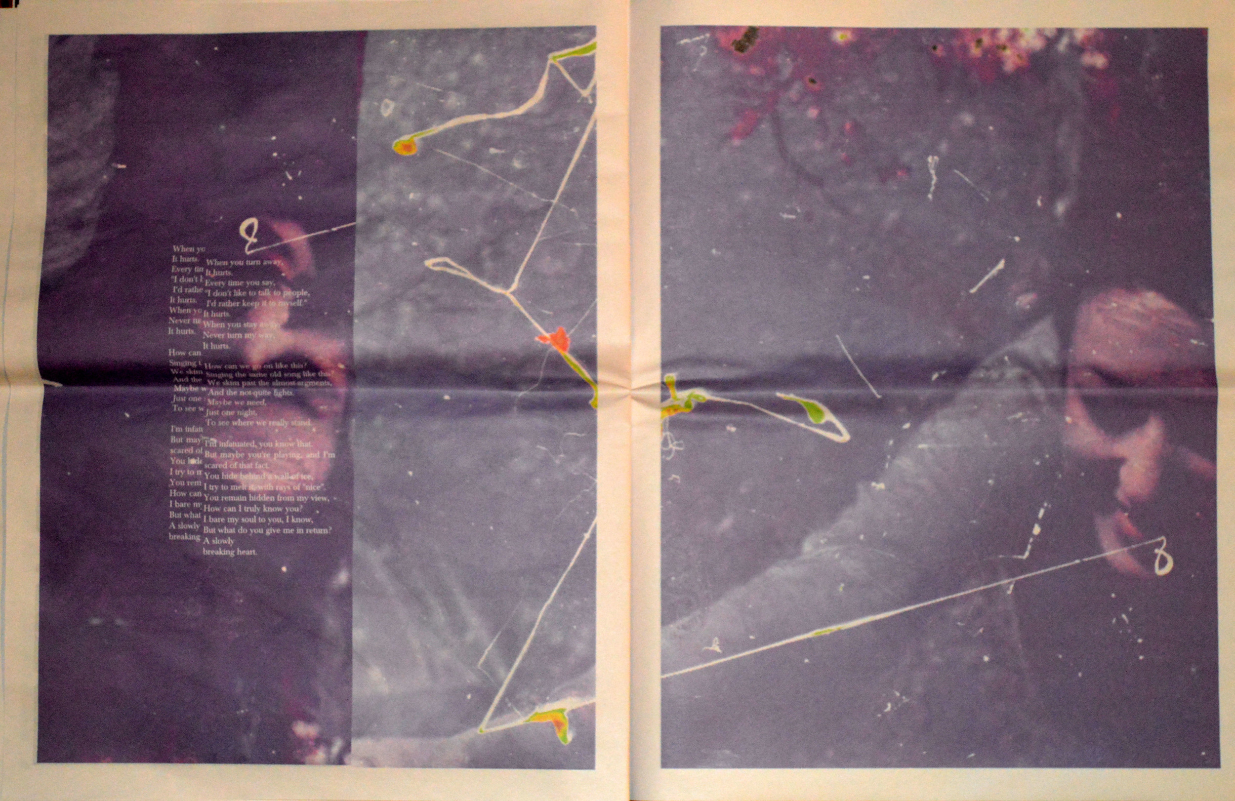
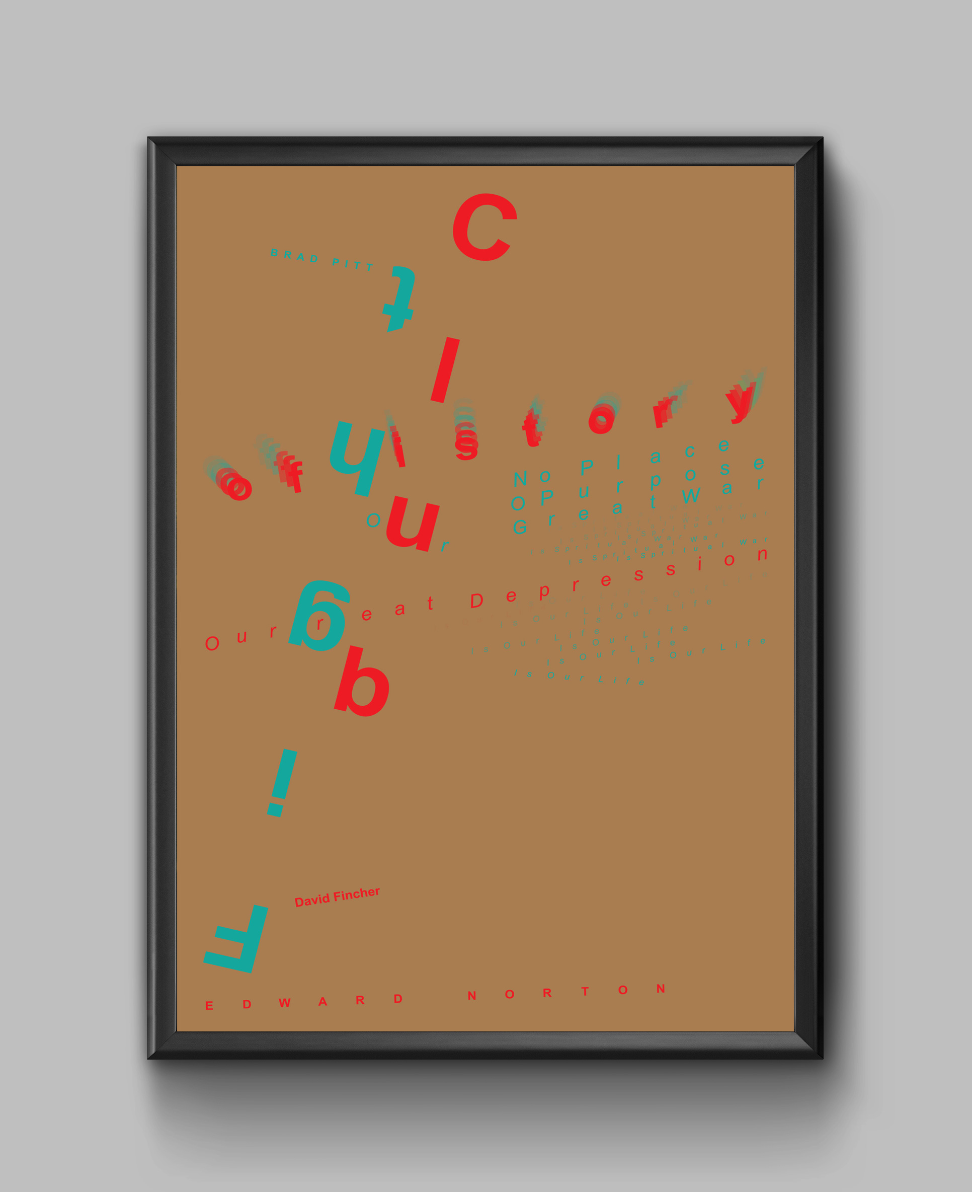
Life is horrible! / Typography and layout
“The secret of happiness is to face the fact that the world is horrible, horrible, horrible.” Bertrand Russell
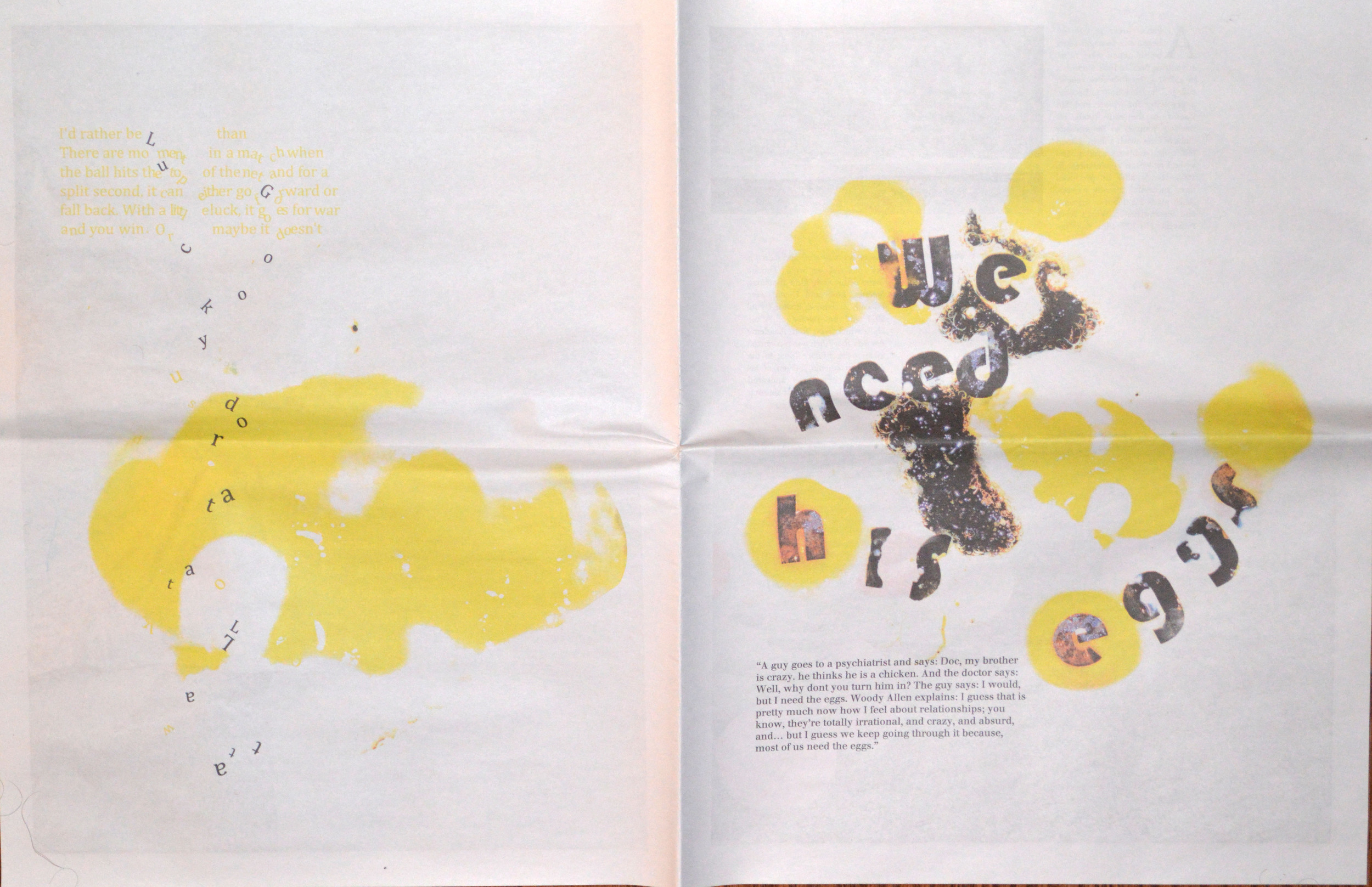
This fictitious newspaper tells stories about the uncertainty of the life, randomness of events, inevitability of death and the constant struggle of human beings in pursuing a vague concept, “Happiness”. Innovative typographic techniques are combined with modified images in a way to reach a symbolic and impressive narrative composition. The contrast between colorful letters and black and white background conveys the complex nuances of the human condition. The convoluted composition of shapes, letters, images and the deconstructed forms of layout, is designed in a way to iconically show our daily struggle to understand the others and to be understood by others in our meaningless relationships.
.
Editorial design
Editorial design
Writing with Images
Editorial design is one of the most important fields of graphic design which has an enormous impact on how written information is understood. It is about to how to combine images and texts to make publications attractive, visually interesting, and easy to read. Although Editorial Design is a term that traditionally used in designing book, newspaper and magazine, but these days it could also refer to designing for online publications. But whether it is print design or digital, a good editorial design should be cohesive, clear, and last but not the least, innovative to draw readers attention into the context. Here are a few samples of my past editorial design experience.

ECHO / Magazine Cover Design

Outsiders / Magazine Layout

ECHO / Magazine Layout

Just a little mistake / Book Cover Design

ECHO / Magazine Cover Design

ECHO / Magazine Layout

Outsiders / Magazine Layout
rebranding with typography
rebranding with typography
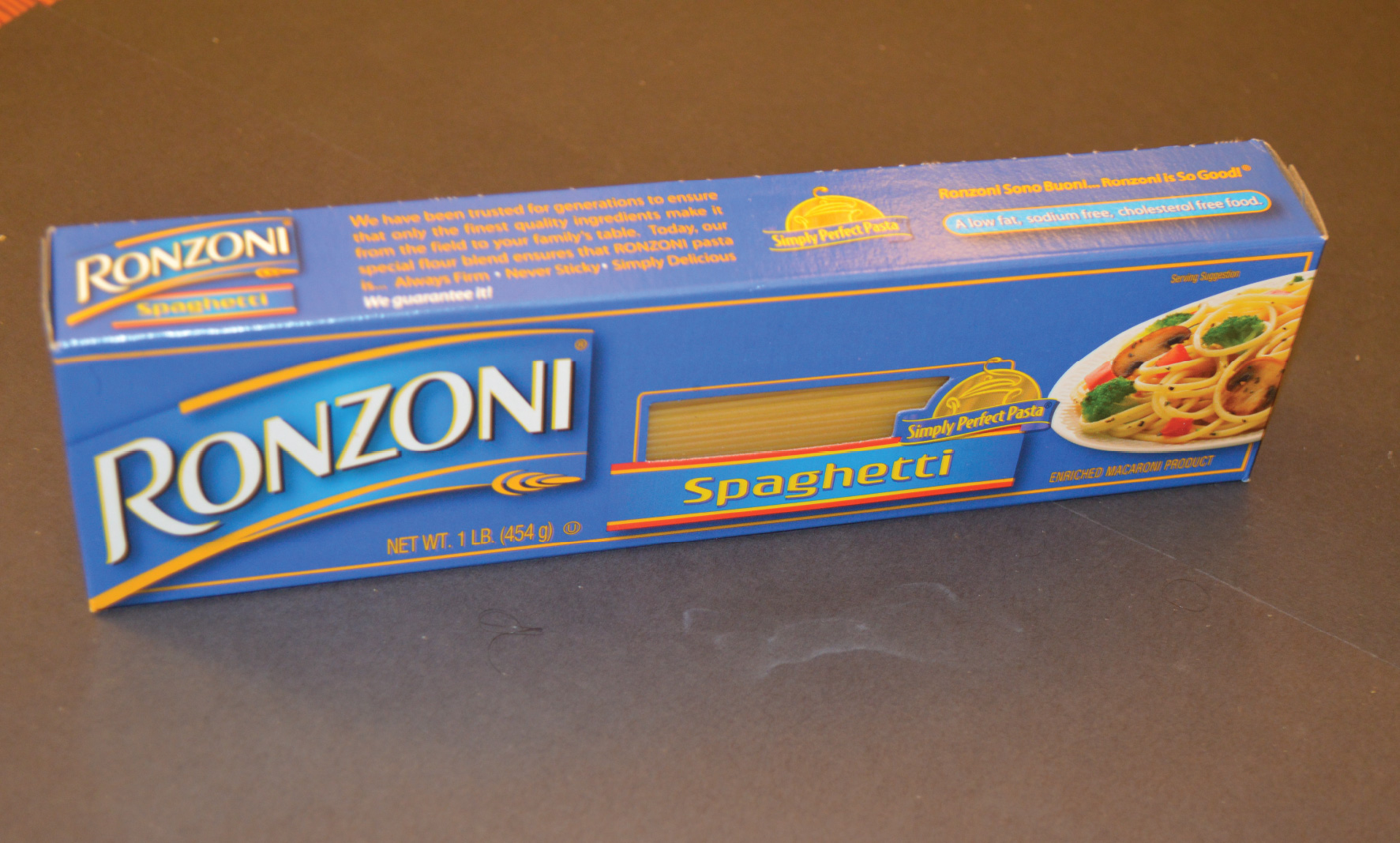
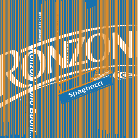
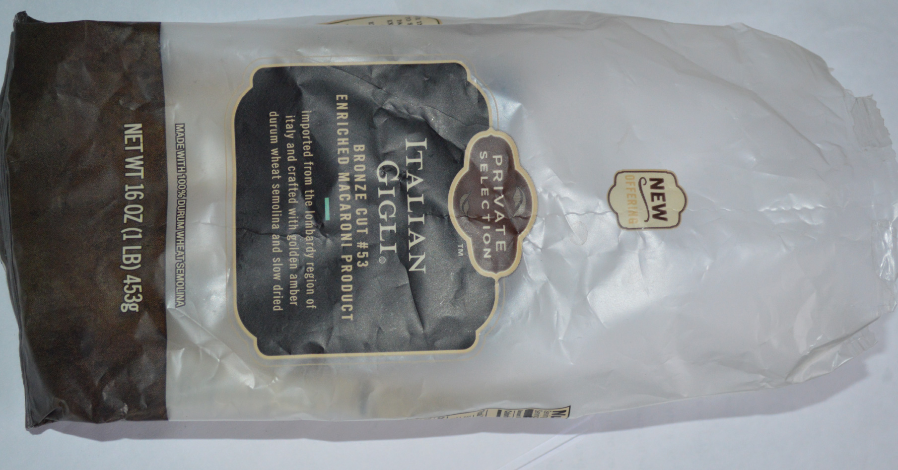
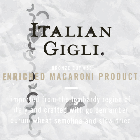
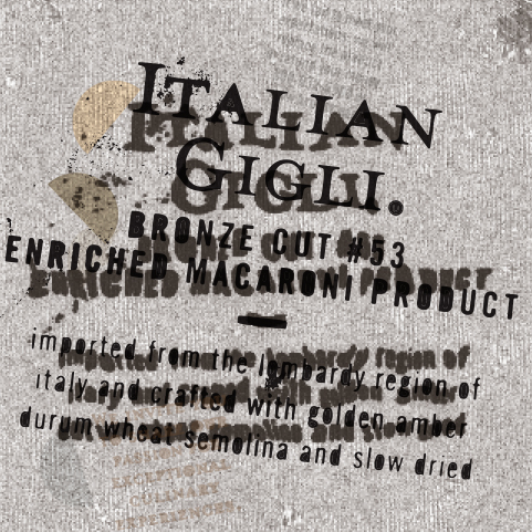
Deconstructing a brand / A visual study on typography and branding
In this project the analytical deconstruction is on the design of two pasta packages. Ronzoni showcases a destruction more committed to the original package design. The final outcome has maintained some of the original features such as dominant blue color, geometric representation of the shapes, and even the implied text follows the same typographic principals. The ideation process is mapped out to share the process of elimination for the sake of celebrating the value of minimalism and the notion of “less is more”. Visual brevity provides the audience with the pleasure of negative space granting the eye movement. Second project supports the same approach by radically deconstructing the original package. There is almost no string of attachment between the final execution and the original package. Even the mapped out ideation process demonstrates various possible reads and goes beyond the conservative type treatment in the original product. The anarchy has not been limited to the type treatment; it manipulates the colors, mood, composition, and function. The newborn piece communicates with a whole new group of audiences dramatically different from the original product.
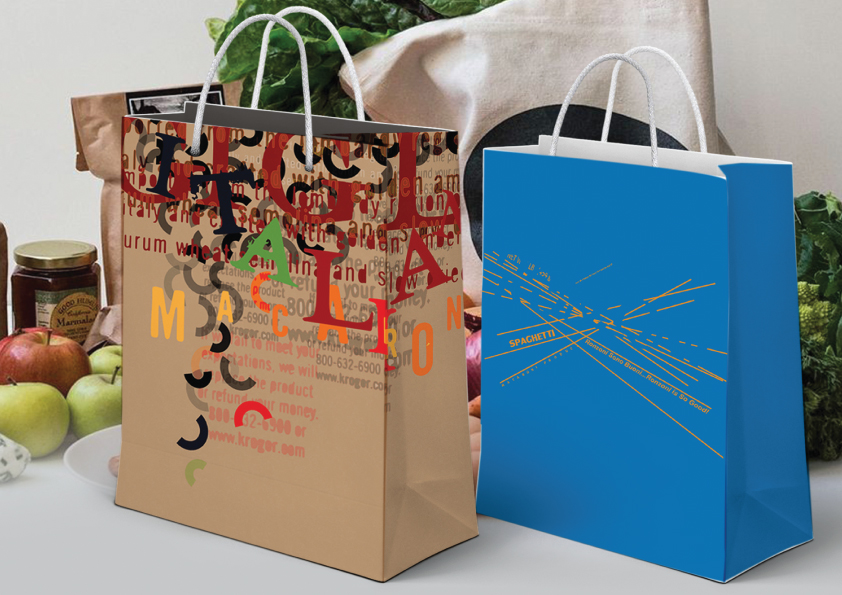
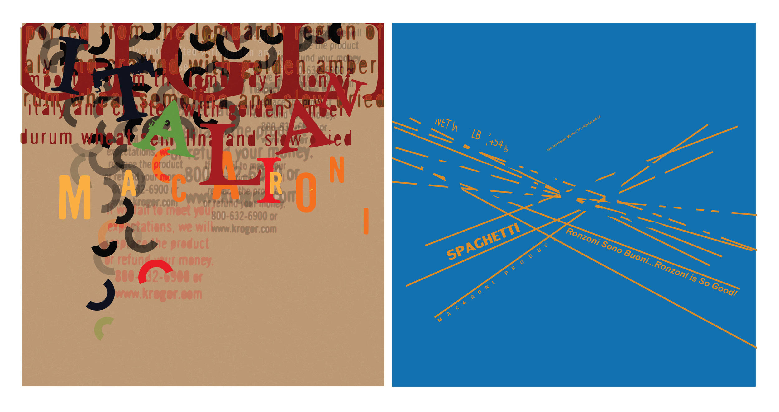
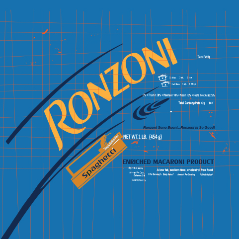
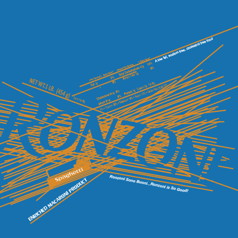
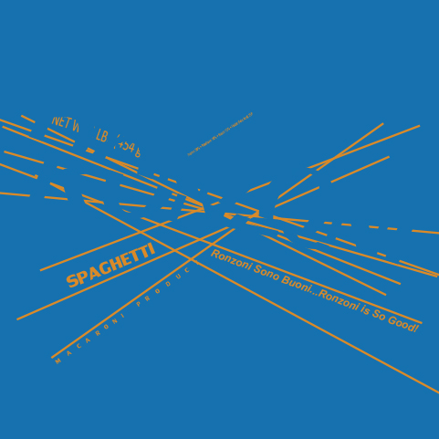
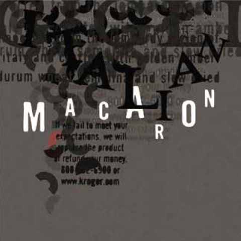
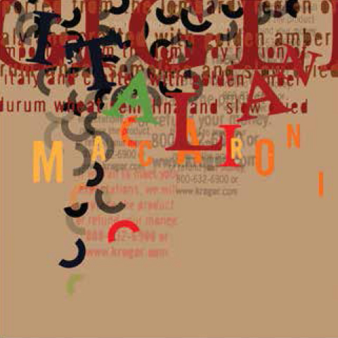
Minimalism is not a medium of choice in this practice neither maximalist has been the main objective. The poetic outlook of the final piece reveals a message right where it seems the knot of the composition is about to be resolved. The peak of this knot is located on top of the composition where the letters are misidentifying themselves and put on a mask. The illusion of resolving is where the autonomous shapes are pouring towards the negative space. This space terminates the audience engagement and let them go.
Motion Design
Motion Design
Live slowly
social Campaign design
social Campaign design
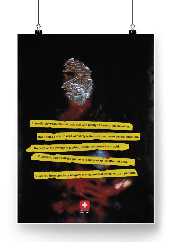
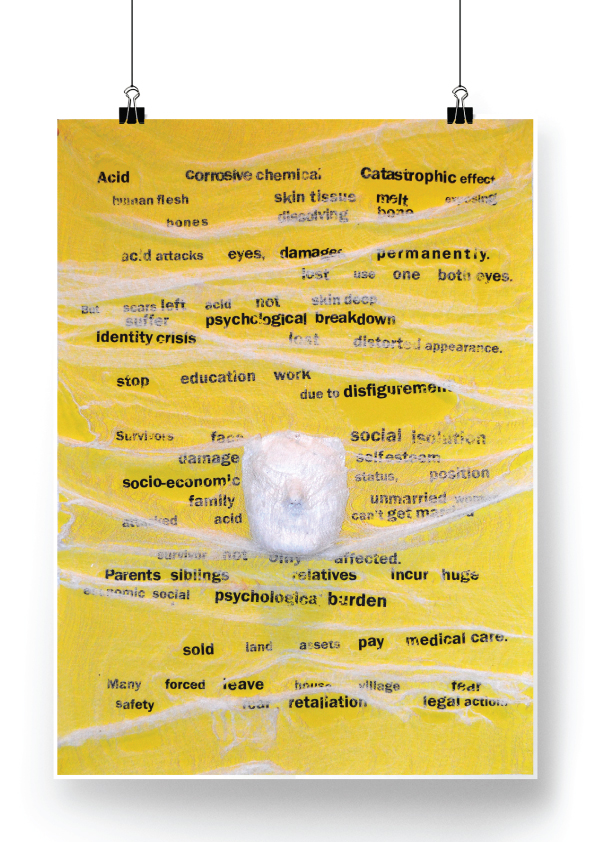
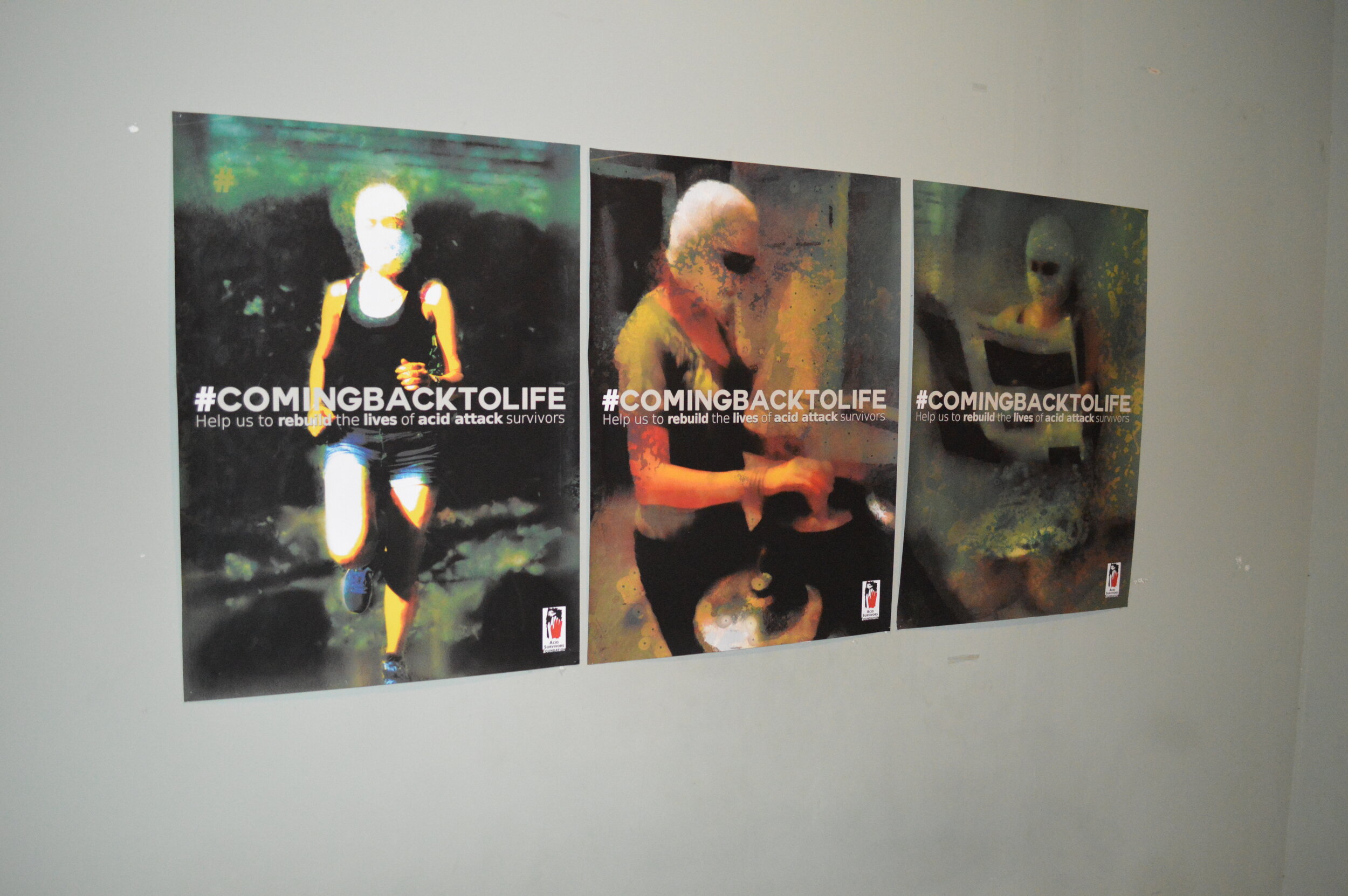
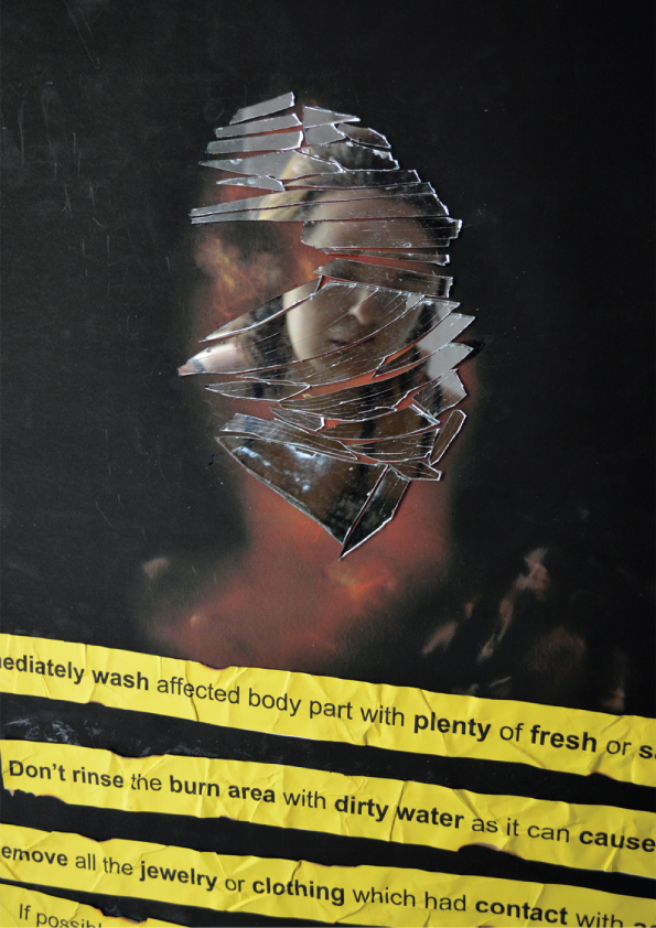
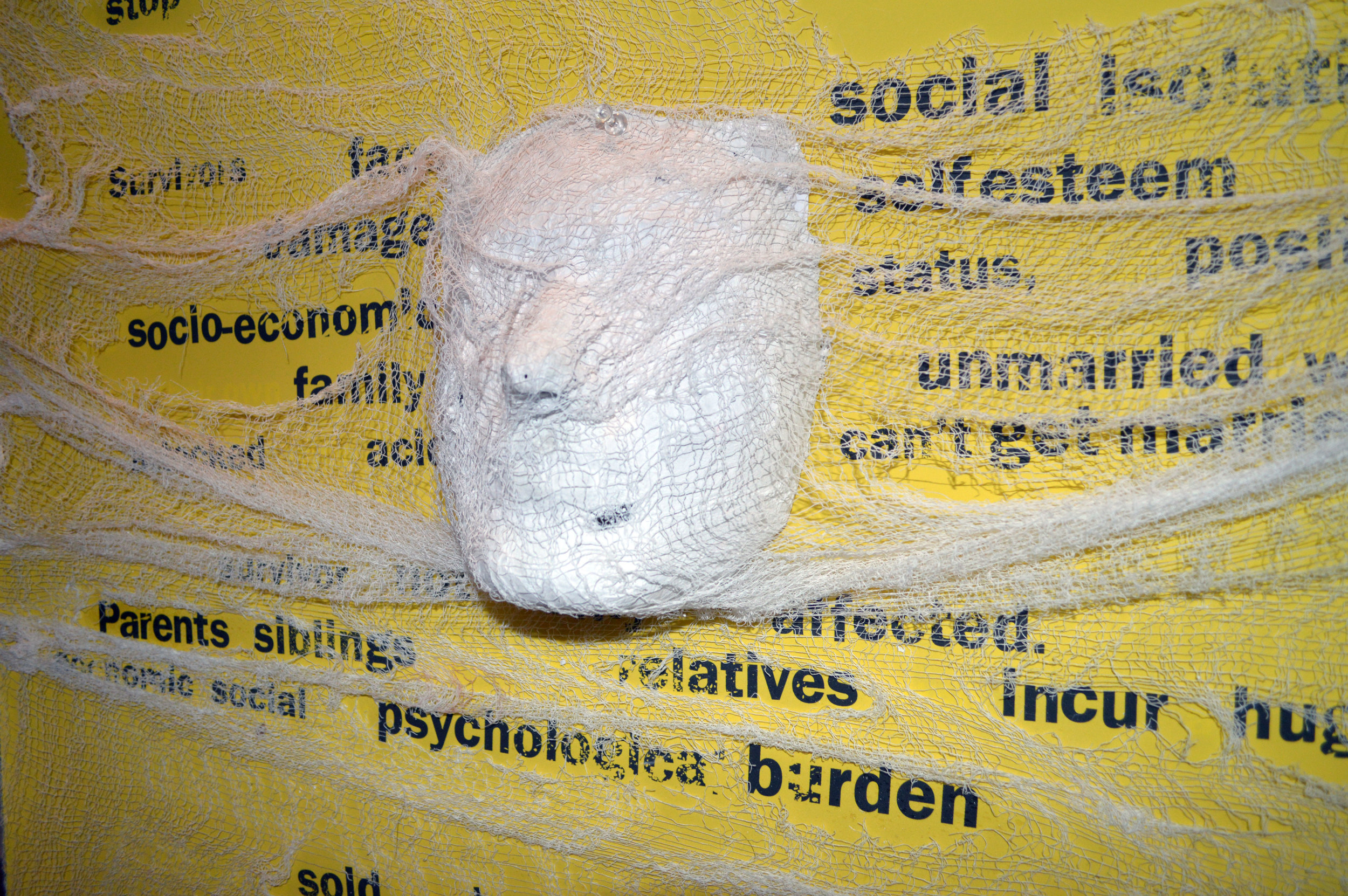
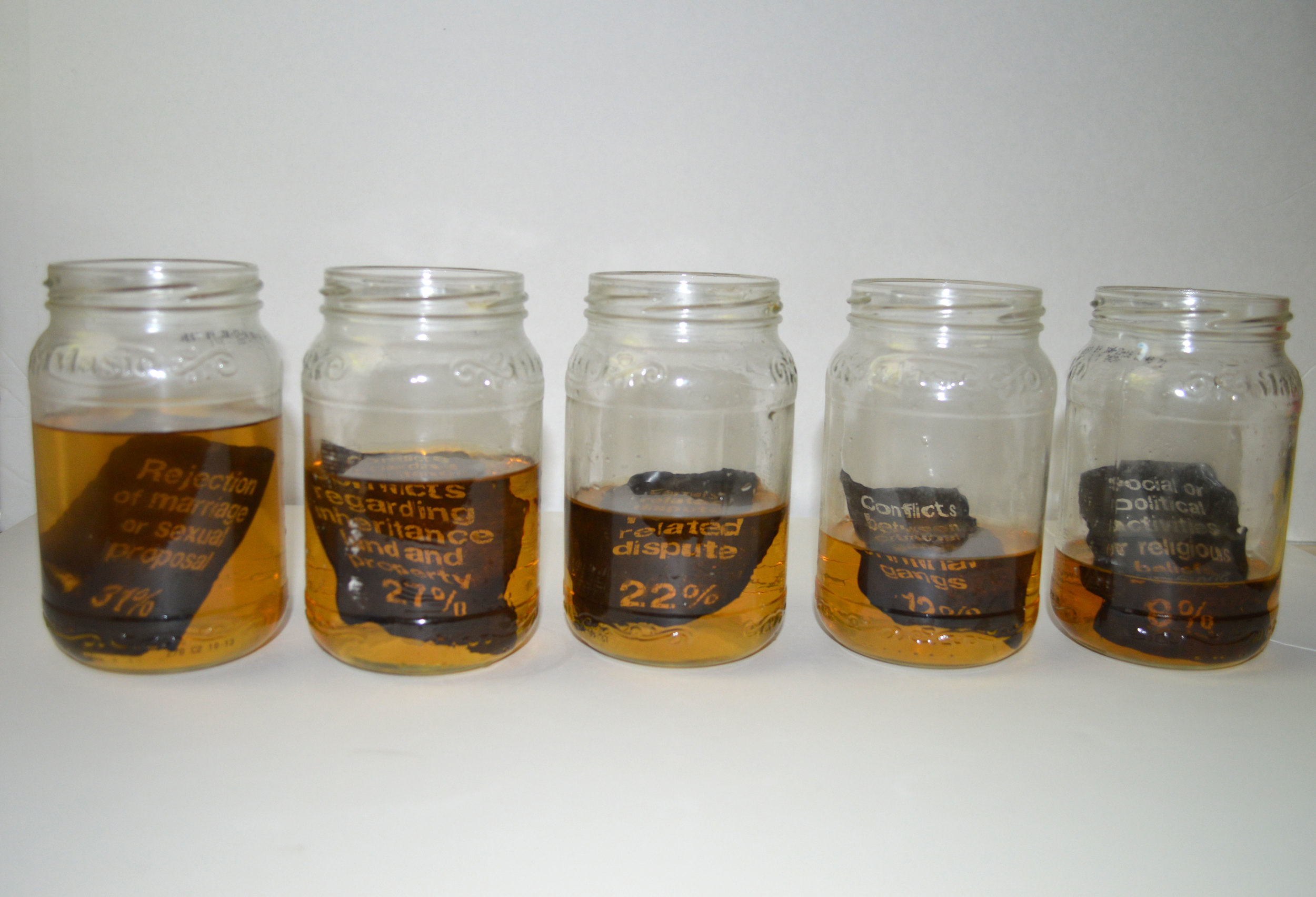
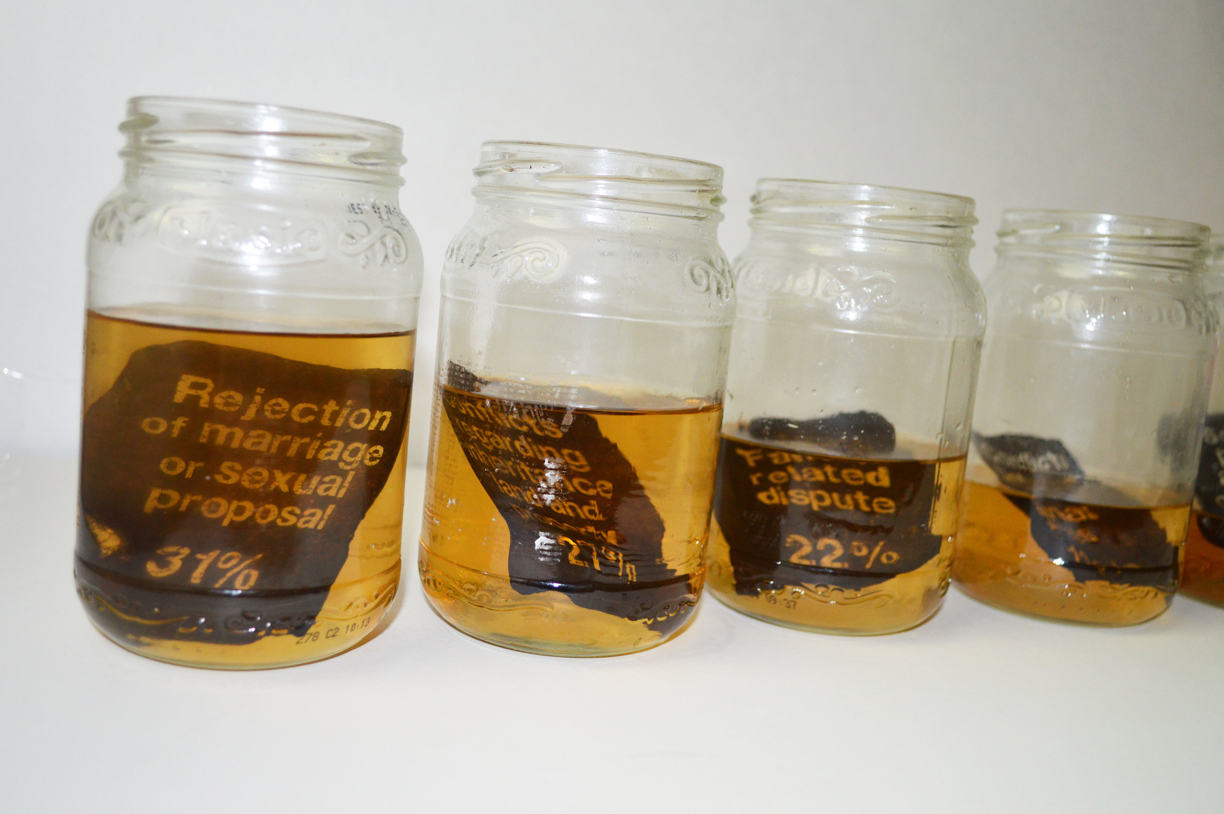
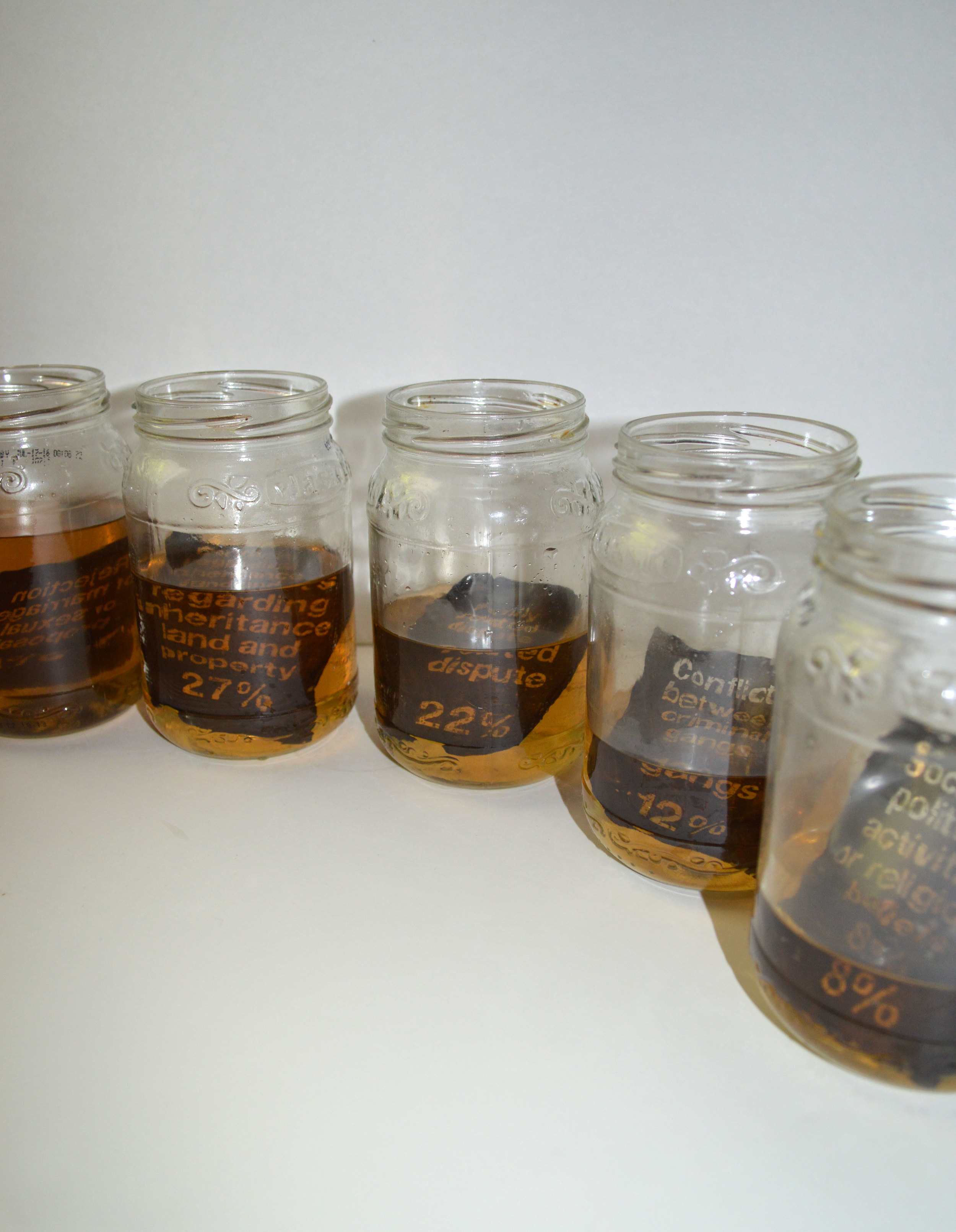
Women Without Face / A social awareness campaign (Multi-Media Visual Information design)
Acid attack is one of the most tragic and frightening form of violence. It is a worldwide phenomenon which is not limited to a specific location, culture or a religion. Acid attack is an extreme expression which reflects mental disorder and public psychological problems within a society. The high number of this brutal action, must be considered as a growing treatment against humanity. Weakness of law, political corruption and cultural inequalities between genders have contributed to this incident in many countries. However, many attacks are unreported and undocumented. For many people it is not a familiar subject related to violence.
This campaign is designed to create a wave of social awareness and sensitivity among people via social media as well as printed media. The goal is to encourage people to join a NGO called “Acid Attack Survivor Foundation” and help them to rebuild the lives of survivors by believing in them, supporting them both psychologically and financially and providing medical treatment.
Album Cover design
Album Cover design
Album cover design
A dead field in design, Right?! But who can deny the unique feeling of having an original LP in hand, covered in a beautiful vinyl with masterful imagery and typography on it? I personally don’t know any music lover who doesn’t enjoy looking again and again at the vintage album covers. Indeed, music and visual art had been hand in hand for decades and album covers were an important part of the released records. These days however, we explore the music in our cellphones via the music apps. But even there, a single square image right next to a title of the song still can grab your attention and invite you to play the song! This is the power of image! The following examples are part of my practice in making visual art for music!
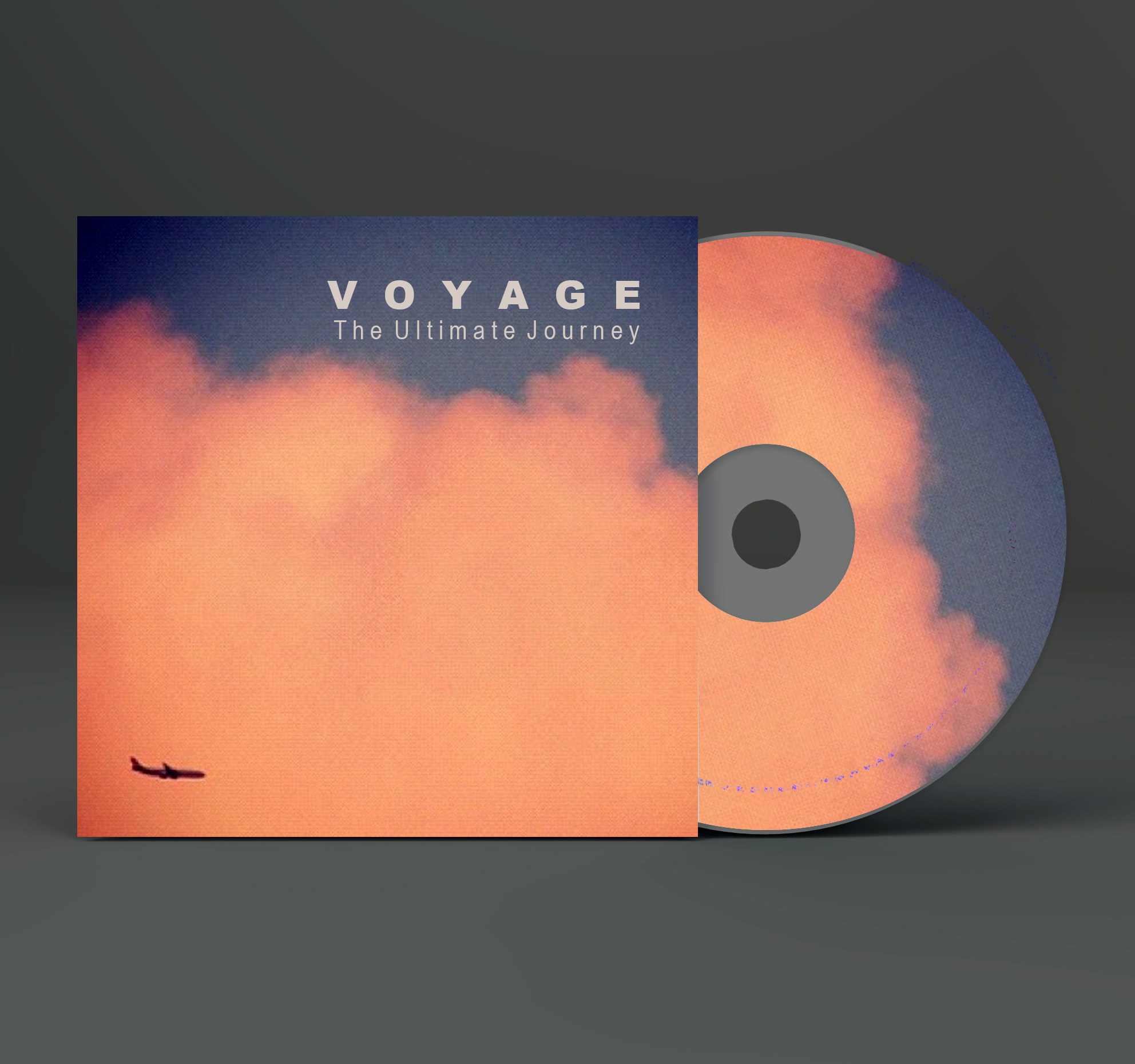
Voyage / The ultimate journey

Deuter / Call of the unknown

Jethro Tull / Living in the past

Lustmord / Dark matter

Anathema / A fine day to exit
POSTER Design
POSTER Design
Advertising
Advertising
UX design
UX design
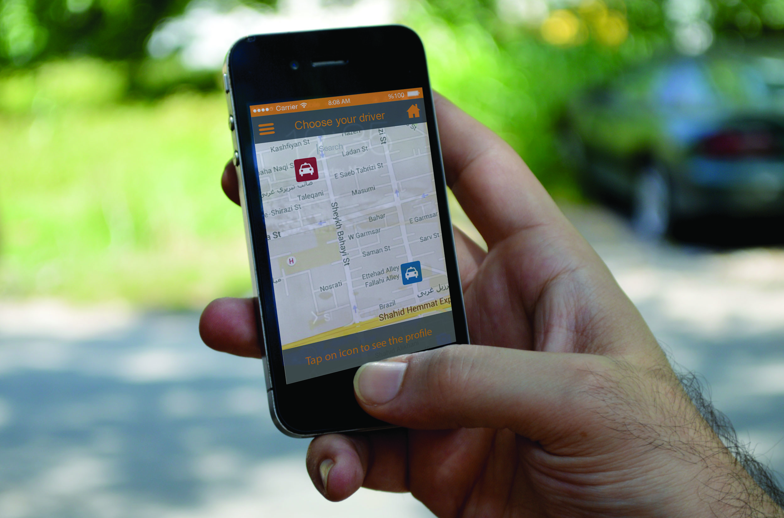
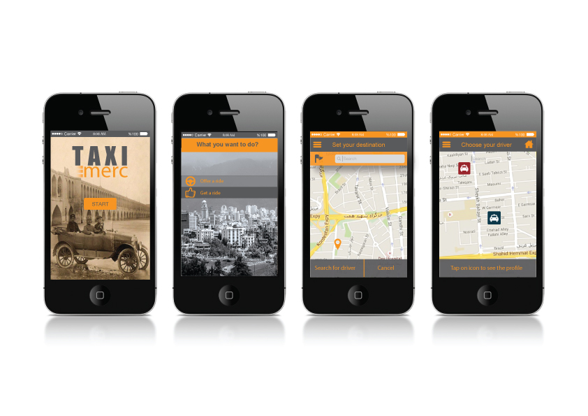
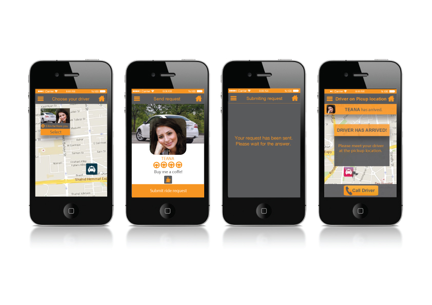
Taxi Merci/ UX Design
Taxi Merci is a smart phone application targeting a wide range of users in Tehran, the capital of Iran. The idea behind this project tends to provide a more systematic solution for those who are interested in ride-sharing as well as those who would like to work in this market. The long-term goal of this mobile application is to pave a path towards a well-developed urban system, traffic free and less unpredictable city.
The design theme approached in this product initiates with a vintage imagery while it gradually blends into a modern interface. The subtle orange color follows a localized narration referencing to the older generation of taxi colors in Tehran. Nowadays variety of colors was replaced and added up even more confusion to the system. The dark gray was the best choice to create a visual contrast to appeal the users and boost the readability of information.
The ultimate goal of this product is to offer a systematic solution compatible with the needs of the current demands and initiate a step forward for the sake a better city to live.
Visual performance
Visual performance
Breakfast in Fallujah / Performance Art
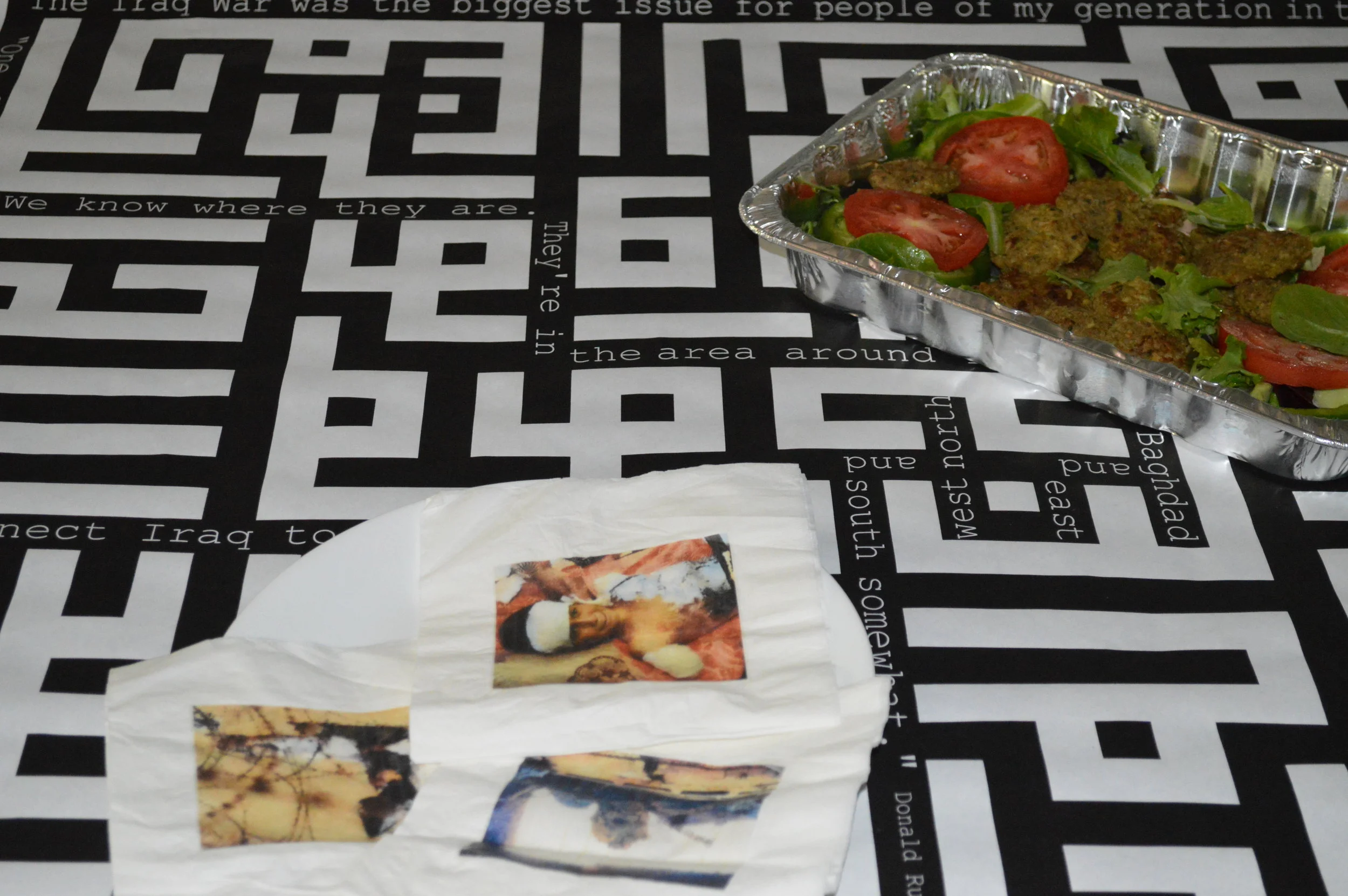
The aim of this performance is to open new channels of thoughts and feelings about Iraq war and its underlying issues. The main strategy of this project is to combine various approaches of communication in order to bring the audience into a discussion about the topic of war. To do so, I used one of the oldest ways of communication among people all around the world; Eating!
In fact, dining a food always can create a social space capable of sharing ideas and thoughts. In this project, an Arabic food called “Kufta”, represents some of the cultural characteristics of the Middle East countries while opening up the conversation over the main topic. The food is served on a tablecloth which is patterned with many visual signifiers of war. Quotes from U.S politicians who were responsible during the war can be readable on the tablecloth. At first glance, it seems that these quotes are placed through the lines of a maze, but in fact, the white lines are Arabic typography depicting a surah of “Quran”, the holly book of Muslums. An old Arabic song is also playing during the serving. But the song is harshly mixed by the politician's speeches on the issue of the Iraq war.
Throughout the performance, some napkins are given to the participants of the show that contain irritant images of war. These images remind the brutal face of war and its disasterous consequences to them while they still have the great taste of the food in their mouthes. On the back side of the napkins there is a tagline inviting the participants to join EPIC Organization which is an NGO that helping those Iraqi children who are affected during the war.


